
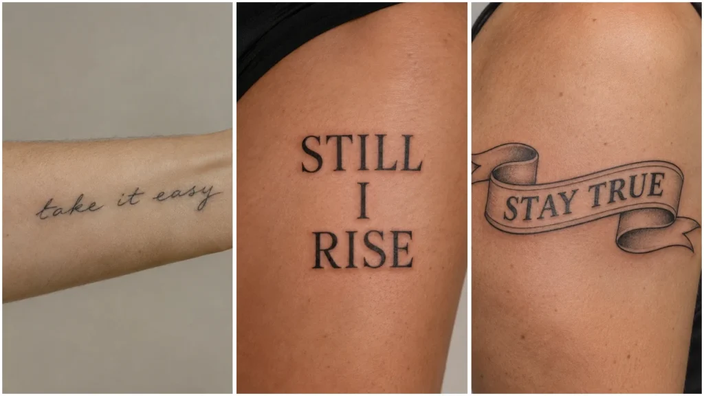
Song lyric tattoos give meaningful words a visual shape through lettering, placement, and small personal details. These 20 concepts help you compare those choices before bringing your preferred lyrics to a tattoo artist.
The images planned below are tattoo concepts, not client results. Any example wording used in them should be original demonstration text, not song lyrics. Start by saving a lettering style and a placement together: the same phrase can feel quite different in bold capitals or a gentle script arc.
Simple Lettering for Song Lyric Tattoos
1. Single-Line Script on the Inner Forearm
One flowing line with the words as the main feature.
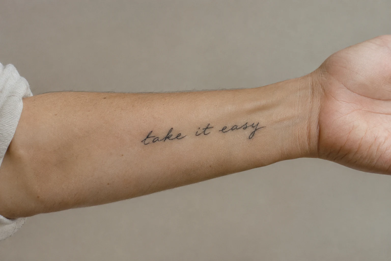
Choose this direction for a short phrase that reads continuously. Ask your artist to balance letter spacing with the available length, and decide which way the words should face when your arm rests.
2. Small Serif Lettering Above the Elbow
A compact phrase with a bookish appearance.
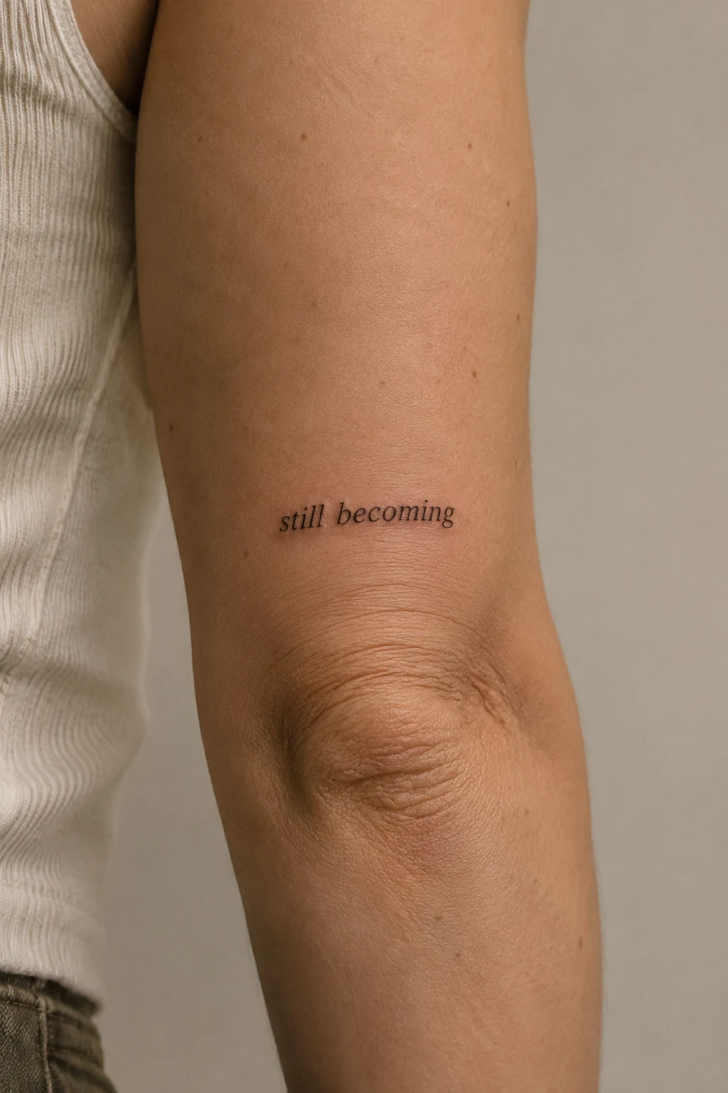
Serif letters bring structure without the flowing connections of script. Keep the wording concise, and discuss how much room the small finishing strokes need at your proposed size.
3. Typewriter Text on the Outer Forearm
Two left-aligned lines with a document-like layout.
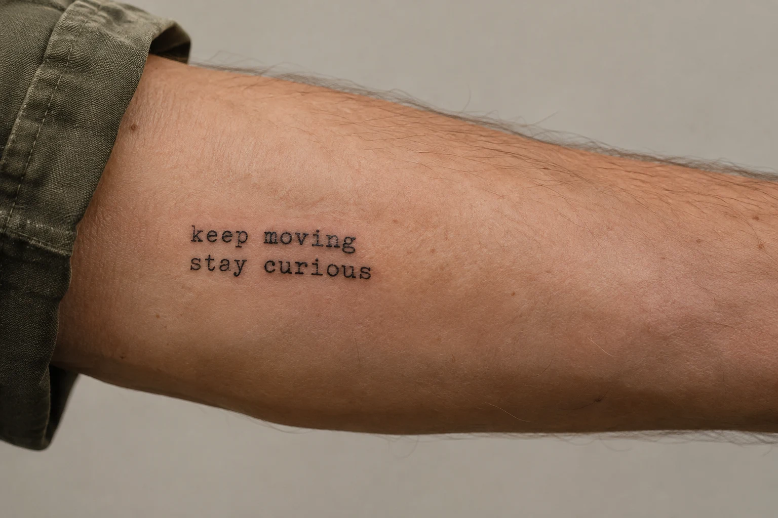
This suits readers who like straightforward, informal lettering. Place the line break where the wording naturally pauses, then check that the two lines feel balanced without forcing equal lengths.
4. Bold Capitals on the Upper Arm
A short phrase with strong, solid letterforms.
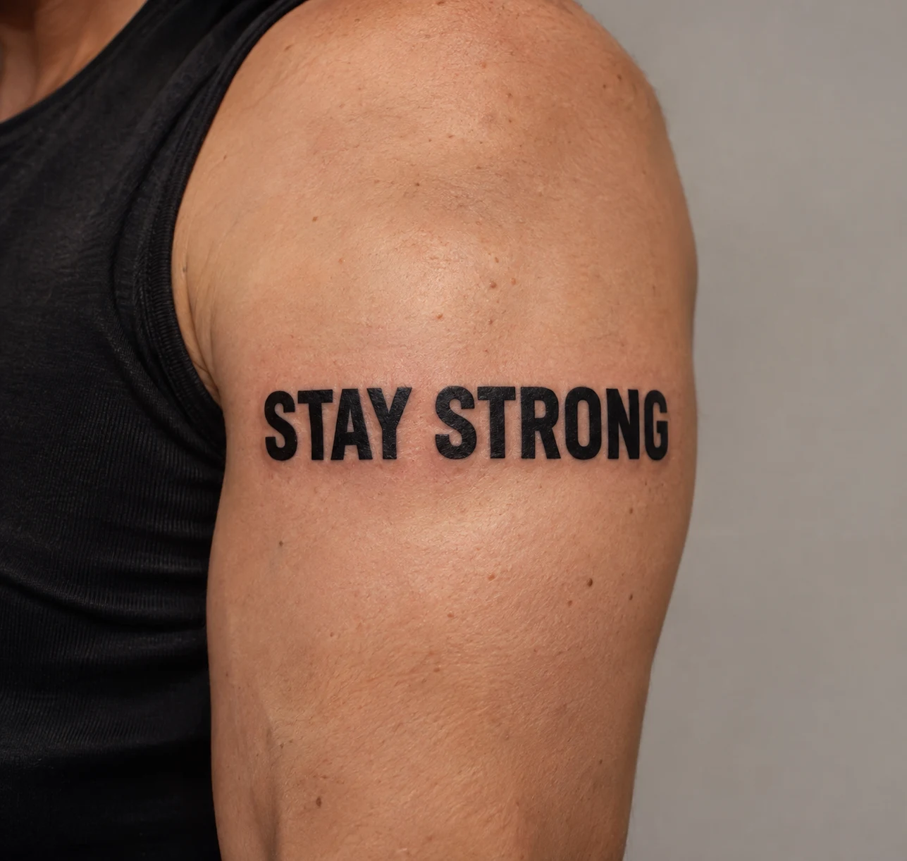
Fewer words leave more space for larger letters. Try this approach when you want a graphic statement, choosing the briefest passage that still carries your intended meaning.
5. Handwritten Lettering on the Inner Bicep
Personal letter shapes in an informal arrangement.
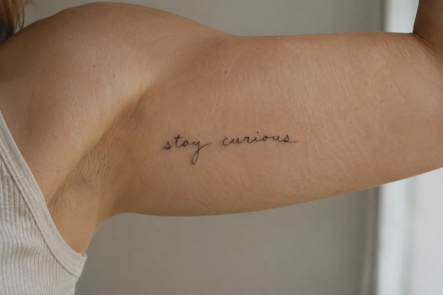
Write your chosen words several times and select the version that feels most like you. Your artist can adjust spacing while preserving details you value, such as an unusual loop or slanted capital.
Placements That Follow the Body
6. A Gentle Script Arc Beneath the Collarbone
A curved phrase beneath one collarbone.
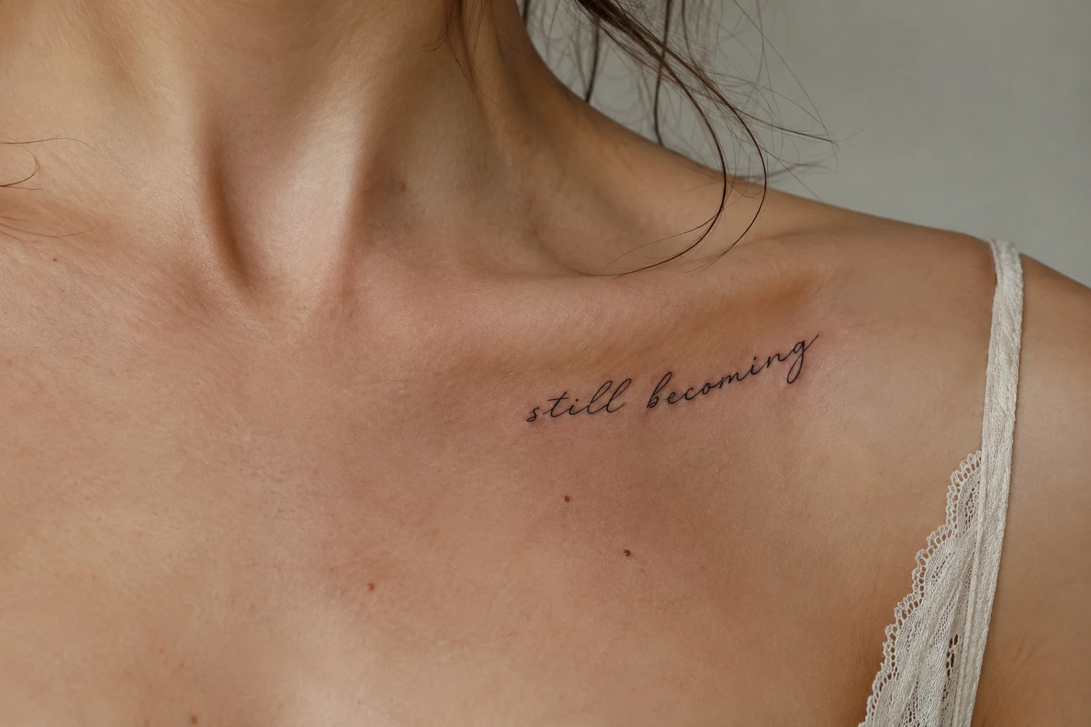
The arc becomes part of the design. Check the stencil while standing naturally with relaxed shoulders, especially where the phrase begins and ends.
7. A Two-Line Phrase Along the Side Ribs
Restrained lettering arranged along the torso.
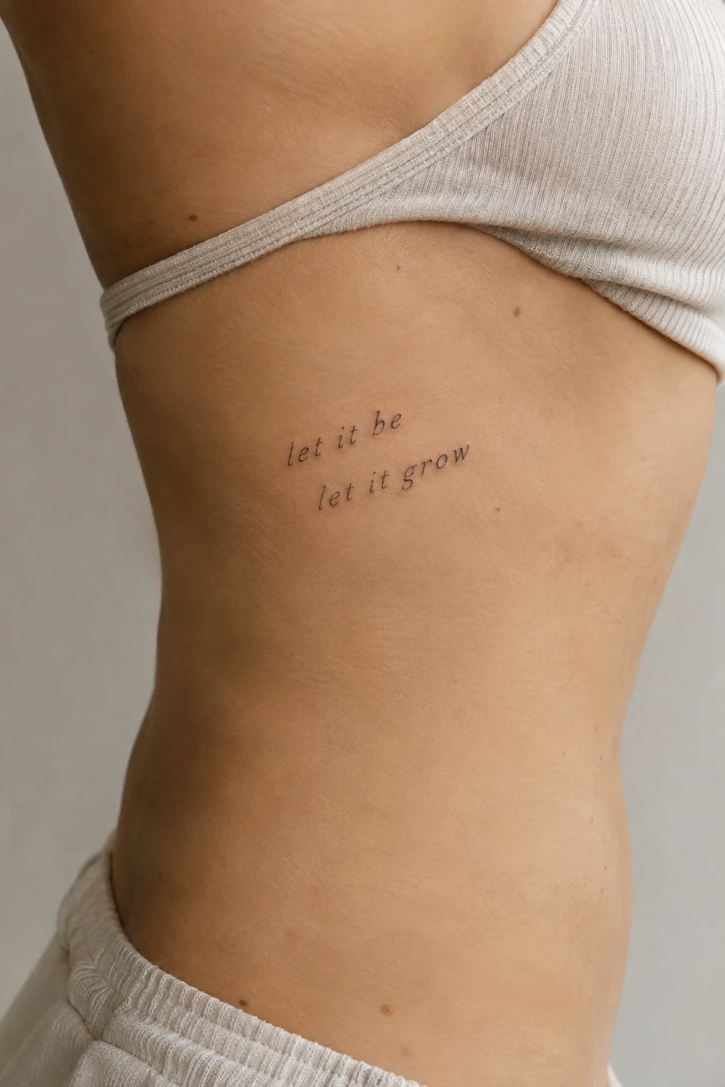
Compare gently angled lines with a level text block. Leave breathing room between them, and consider how much you want visible in your usual clothing.
8. Stacked Words Down the Spine
Upright words forming a narrow vertical column.
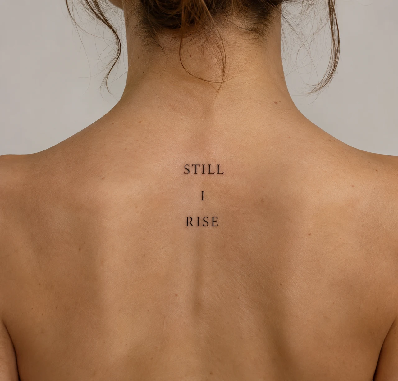
Each word occupies its own line, rather than turning the sentence sideways. This works best when the stacking preserves a clear reading order; assess the full stencil before choosing the gaps.
9. A Curved Line Around the Shoulder Cap
Lettering following the shoulder’s outer curve.
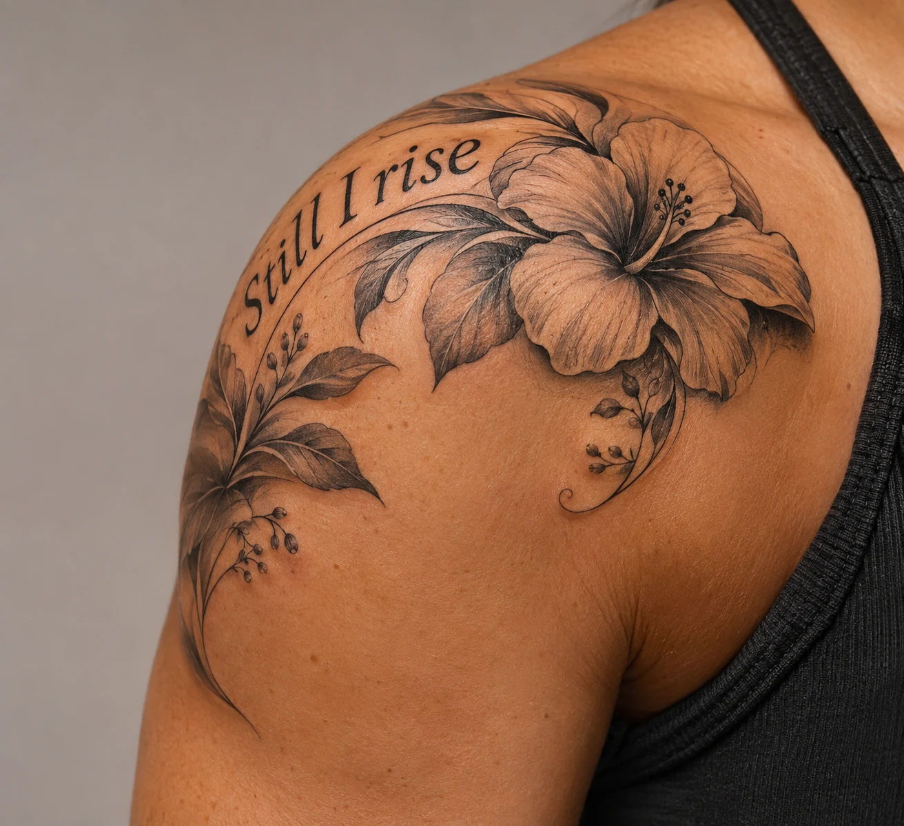
Part of the phrase wraps out of view as the shoulder turns. Review the arrangement from the front, side, and back to decide where its most meaningful words should sit.
10. An Open Text Band Above the Ankle
A partial lettering band with a deliberate gap.
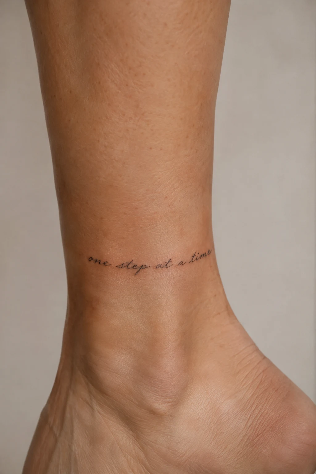
The partial wrap creates a band-like shape without closing the text into a ring. Position the gap intentionally so the phrase has an obvious beginning and ending.
Text Arrangements With a Distinct Shape
11. A Centered Three-Line Text Block
Three balanced lines on the outer thigh.
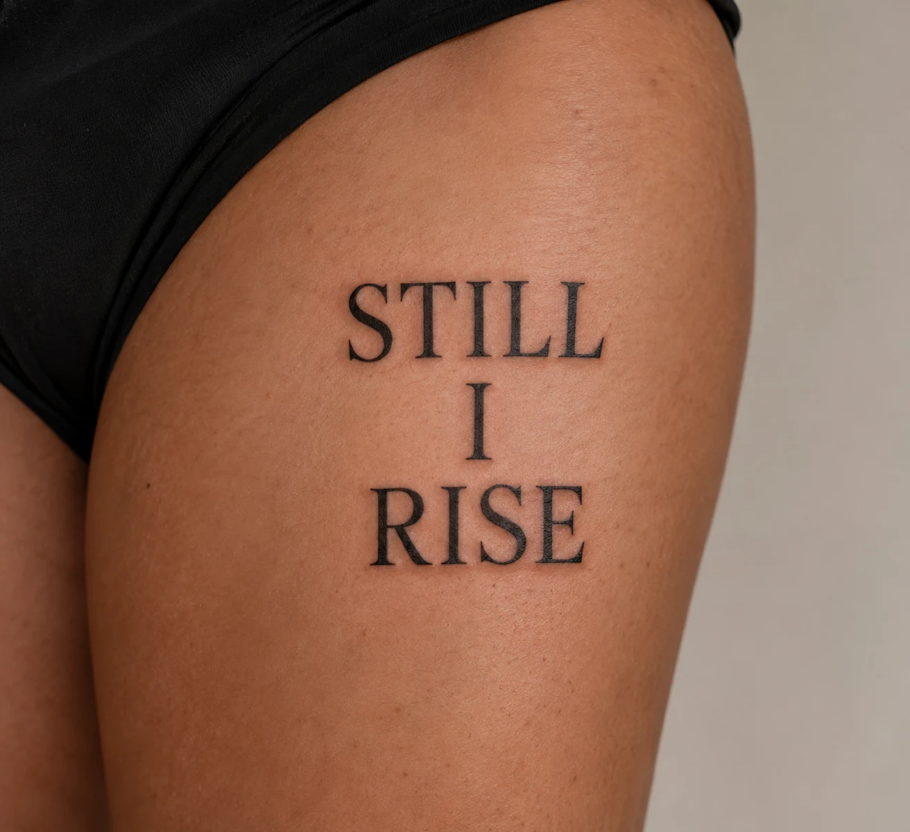
This gives longer wording a compact shape. Try several line breaks, keeping connected thoughts together before adjusting the lines for visual balance.
12. One Emphasized Word in a Mixed-Lettering Design
Quiet print paired with one larger handwritten word.
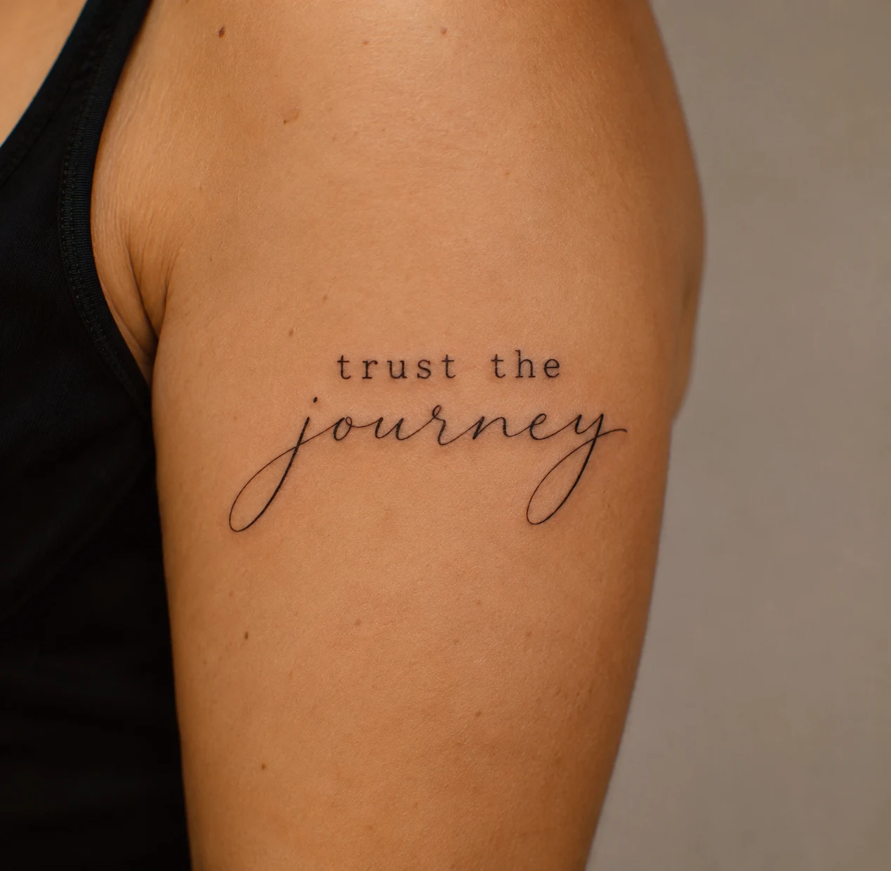
Choose the word you want the eye to find first. Keep its position within the sentence clear so the change in lettering doesn’t scramble the reading order.
13. A Circular Text Arrangement on the Calf
A ring of words around an open center.
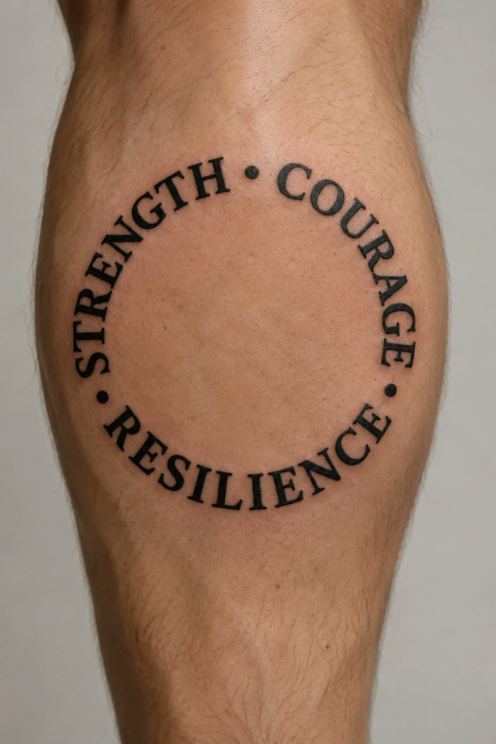
The circular outline creates a self-contained composition. A small gap can mark the start; check how easily you can follow the phrase around the complete stencil.
14. Two Phrases Across Paired Forearms
Related words divided between your two arms.
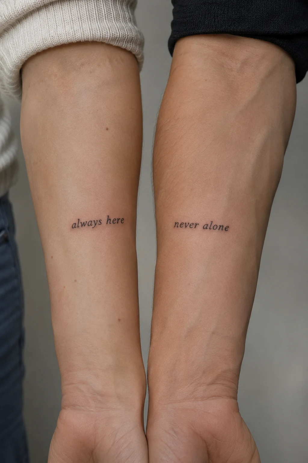
Balance the phrases using matching lettering and compatible scale. Each side should also feel intentional when your arms are apart, even if the full passage reads across both.
15. A Text Block With an Open Rectangular Frame
Compact lettering within a thin, broken border.
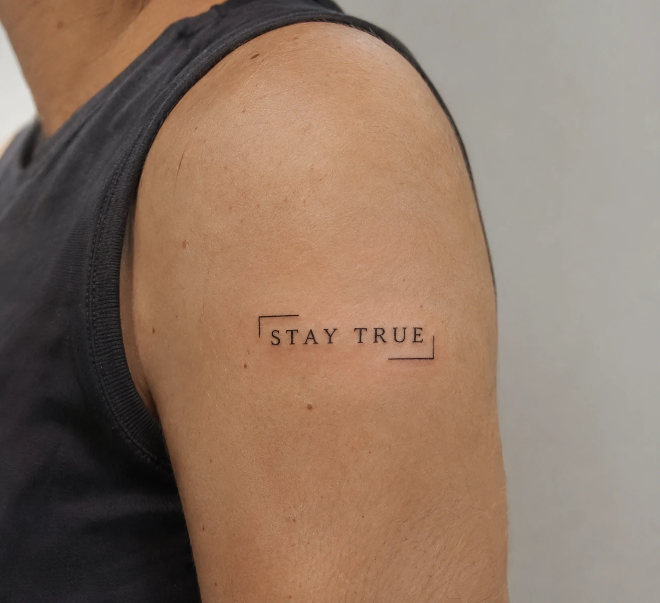
The frame gives the words a defined boundary. Leave enough space between text and border for both to read clearly, and choose where the opening best balances the composition.
Personal Details Around the Words
16. Lettering Along a Botanical Stem
Script following a curved stem with sparse leaves.
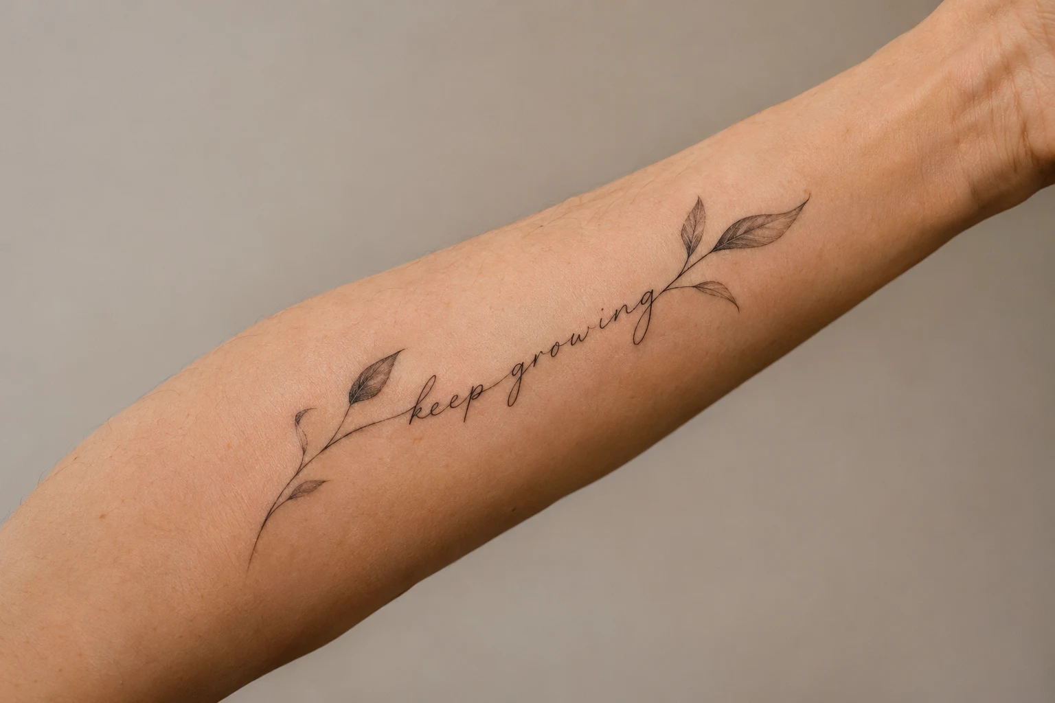
Pick a plant for its appearance or your own connection to it. Let the stem guide the phrase while keeping leaves away from important letter shapes.
17. A Phrase Beneath a Mountain Outline
A simple landscape above a short line of text.
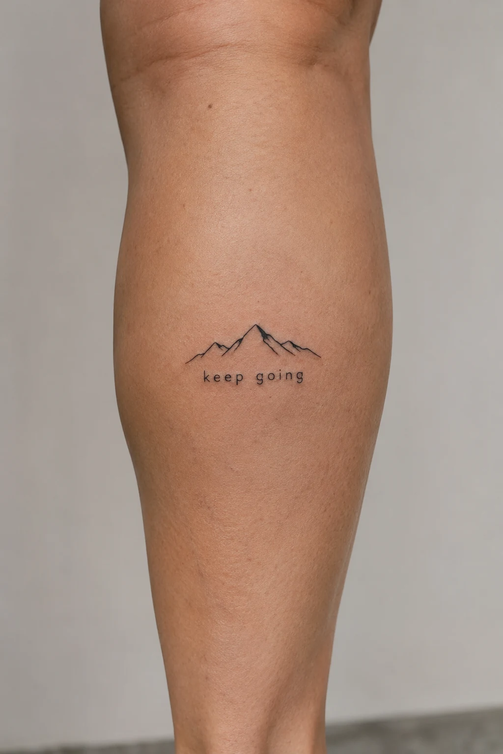
Pair the words with a landscape when the song connects with a place, trip, or memory. A recognizable personal landscape can make the pairing specific without requiring a detailed scene.
18. A Personal Date Beneath the Words
A smaller numeric date beneath the main phrase.
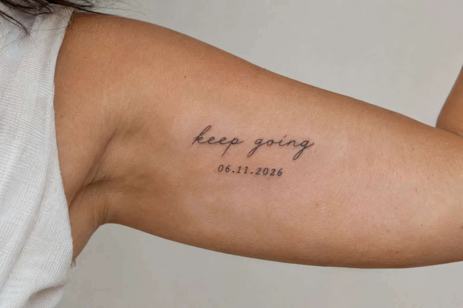
A concert or milestone date adds context without another illustration. Choose a date format you’ll read unambiguously, and keep it visually secondary to the words.
19. Lettering With a Single Red Underline
Black text with one restrained color accent.
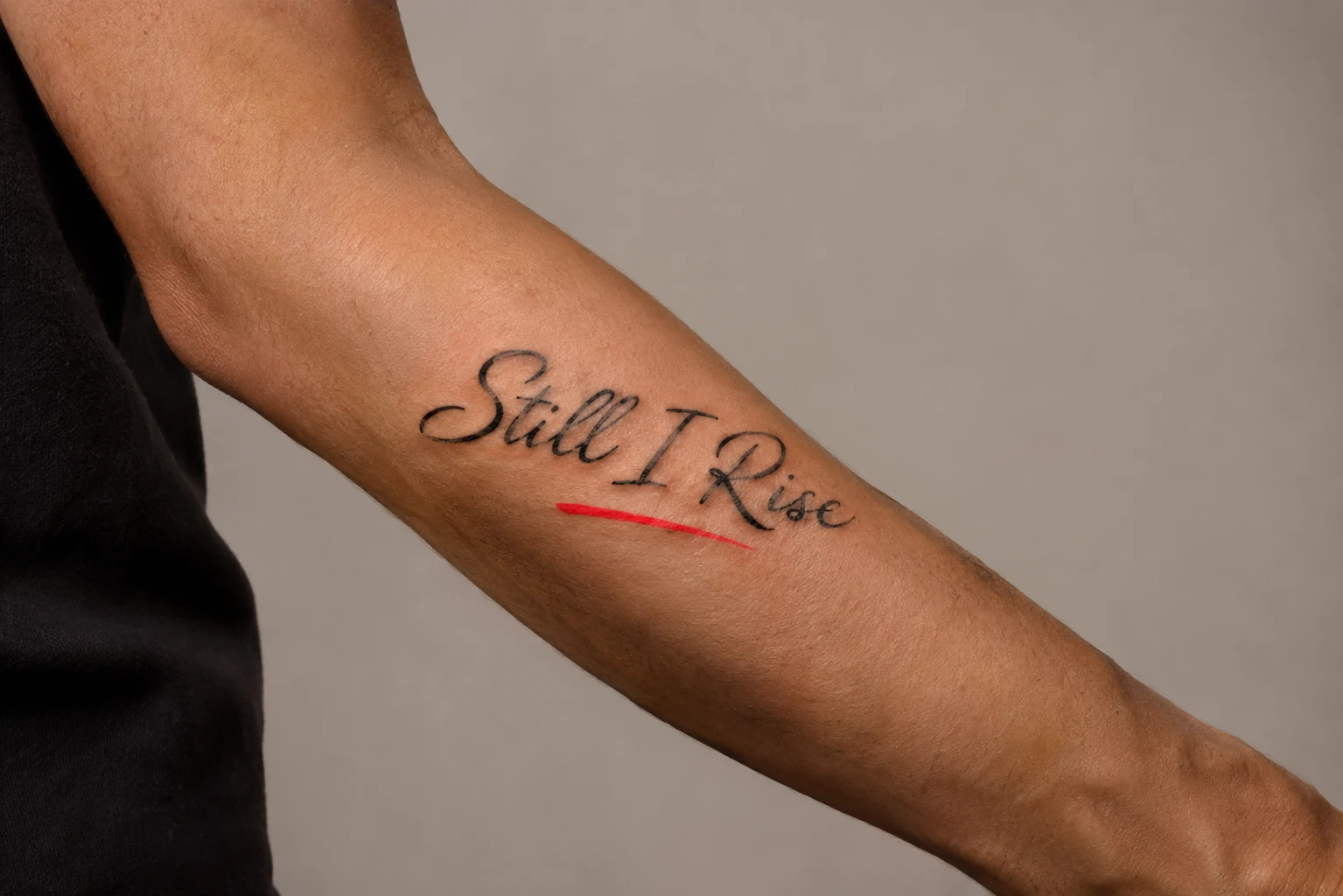
Underline one significant word or extend the accent beneath the phrase. Its length changes the emphasis, so compare both versions before settling on the layout.
20. A Flowing Ribbon With Lettering
A short phrase carried by an outlined banner.
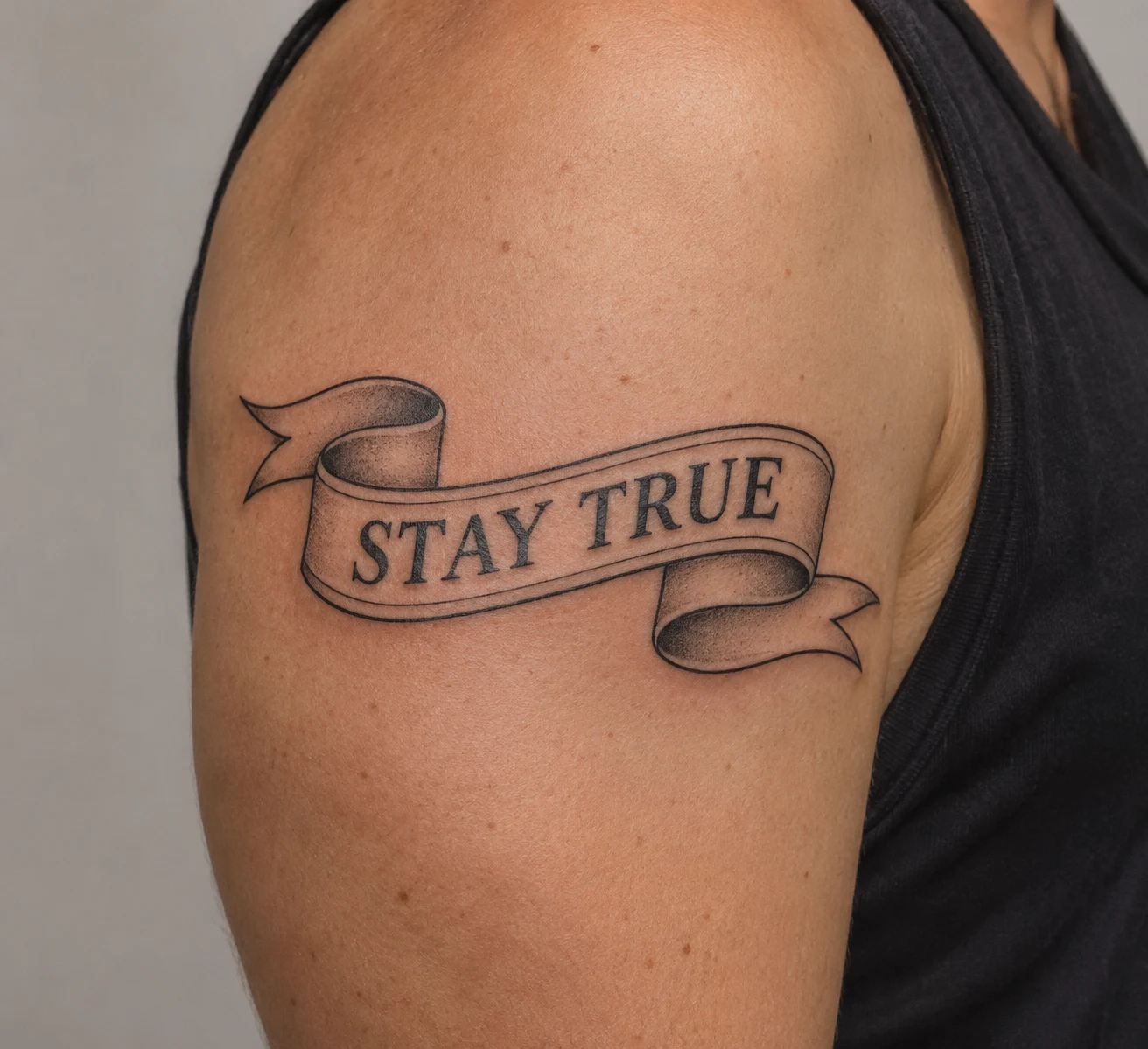
A ribbon gives the words a more illustrated setting. Plan the wording around the ribbon’s folds so important letters stay on the open sections of the banner.
Choosing Your Design
Narrow your shortlist to one lettering style, one placement, and an optional personal detail. Bring your exact preferred wording to your artist, then check spelling, punctuation, line breaks, scale, and stencil orientation together. Confirm the wording against your intended song version before your appointment.
For ideas beyond lettering, explore tattoos for music lovers.

